These sonification samples have been produced by Monash University’s Inclusive Technologies group.
Flattening the curve
On the left we hear the curve (number of active cases) without protective measures as a siren, with higher pitch indicating more cases. White noise static comes in when the healthcare system exceeds capacity.
On the right we hear the curve with protective measures as a choir. The white noise static fades in as the healthcare system approaches its capacity but fades out quickly.
COVID-19 Infections in Victoria, Australia
COVID-19 confirmed cases, deaths and recoveries in Victoria, Australia from March to September 2020.
Sonification with accessible controls at https://www.gravvitas.org/sonification/covid.html
Napoleon’s March
Minard’s Napoleon’s March is one of the most famous examples of an infographic. It depicts the movement and number of French troops marching from France to Russia and back in Napoleon’s campaign of 1812-1813, with indications for temperature and major events such as river crossings and battles.
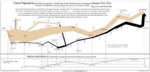
Our sonified version of Napoleon’s March uses music samples to convey the evoke the era and emotion, and spoken text to include the complex information. The sonification with accessible controls is located at https://www.gravvitas.org/sonification/napoleon.html.
Daily weather predictions
Sample weather predictions with hourly temperature, wind speed, wind direction and rainfall, with controls for date and speed at https://bokbok.github.io/weather/.