When to use written descriptions
Written descriptions are relatively quick and easy to produce, and can therefore be considered for most graphics. Even when another accessible format is being provided, a short description often helps to provide a quick overview and orientation.
A description is not required when:
- the image is purely decorative and does not add meaning; or
- the required information is already described in the caption or surrounding text.
A description is helpful when:
- the image directly conveys information
- the image illustrates a concept and/or makes it more memorable, e.g. cartoons
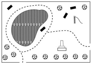
A description is inadequate when the diagram has an important spatial component, e.g. maps, scatter plots or complex process/flow charts. However, it can still be useful as an accompaniment to the more suitable format. For example, a short description of the type of diagram and direction of reading assists with interpretation of a tactile graphic, as illustrated below.

Placement of image descriptions
Short descriptions giving the type and/or title of a graphic can be included as a caption for all readers.
Alt text provides additional information specifically for vision impaired users on websites and in electronic documents. This should be a maximum of 250 characters.
Longer written descriptions making use of lists or tables are best integrated into the accessible document.
Some tips for writing image descriptions
- Start general then move to specifics. When we view an image, we see the whole first then inspect details that we are interested in. To mirror this experience, a written description should start with the title (if it was not given in a caption) and the type of image, for example “stacked vertical bar chart”, “venn diagram”, “oil painting”. Next, describe the parameters, such as the axis labels and data range on a graph, the number of sets and their labels on a venn diagram, or the setting and main features of a painting. And finally, give the detail.
- Be systematic. When describing the detail, move around the diagram in a logical and defined order. For a complex image, you may like to describe spatial positions using the clock face, compass directions or quadrants.
- Consider the context. Read the caption and surrounding text. Do not repeat this information. Tailor your description according to its purpose and the audience. Consider the likely age of the reader. If the image is intended mainly as decorative or for interest, the description should be very brief. If a student will be asked questions based on the image, you need to provide the information they require without giving away the answer.
- Descriptions should be simple and predictable. Use plain language for a wide audience, incorporating more technical terms only when they are also used in the surrounding text. If describing a series of items, use the same sentence structure for each item. There is usually no need to describe the appearance or colour of symbols or chart elements; just give their meaning.
- Know your stuff. If you are not familiar with the type of image or its content, seek help from an expert or do some research. Descriptions for test materials should be written in consultation with the examiner. For other materials, conduct an internet search or a reverse image search. But do not just copy and paste what you find! You will still need to craft a succinct description tailored to the image purpose and audience.
- Avoid interpretation. Describe what you see in the image, but not what you think about it, so that the reader is able to draw their own conclusions. For example, “smiling” is better than “happy”.
- Don’t reinvent the wheel. There are many, many excellent examples of image descriptions that can be used as the basis of new descriptions. Make use of the guidelines and training resources listed below, and keep a collection of good diagram descriptions that you can use as templates.
- Ensure the description can be read correctly by a screen reader if that is the most likely way it will be accessed, as in the case of alt text. Use correct punctuation and grammar. Initialisms that need to be read as separate letters should be written with spaces, i.e. U S, F B I or O M G. Likewise, abbreviations should be spelled out, for example km/s should be written as kilometres per second.
- Check your work. Ask others to check your description or listen to it yourself using a screen reader. Can you draw the image from your description? Does this drawing give the most important information? Was the description easy to follow?
Further guidelines, examples and training
- POET image description training module
- NCAM Guidelines for Describing STEM images
- DIAGRAM webinar on how to describe complex images for accessibility
- DIAGRAM Image Description Guidelines (2015)
- Round Table Guidelines on Conveying Visual Information (2005)
- DAISY Consortium webinars on “The Art and Science of Describing Images” part 1 and part 2
- Art Beyond Sight’s Guidelines for Verbal Description of artworks
- MathSpeak grammar rules or Larry’s Speakeasy Guidelines for Spoken Mathematics should be used for describing equations.
Last updated: February 13, 2021 at 13:25 pm